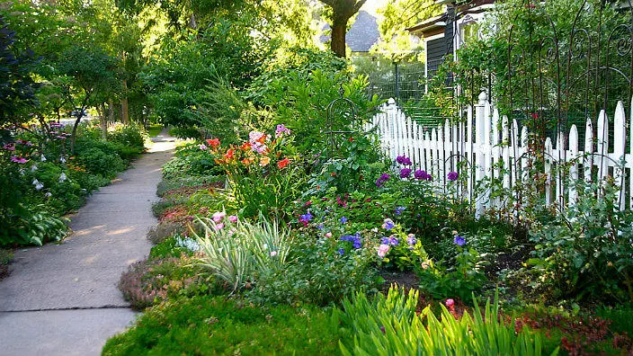
The Basic Principles Of Landscape Design
Whether you plan on “borrowing ideas” or plan on creating your own landscaping design, you should have at the very least a basic understanding of the principles of landscape design.
This doesn’t mean that you have to apply every principle to every part of your plan. But just having an understanding of these principles will help you generate ideas and increase your creativity.
Great landscaping lies in the eyes of the its creator. So, while the principles of landscape design are great guidelines to follow, don’t feel like they’re the “have to rules” of landscaping. Abstract and creativity are allowed.
Unity should be one of your main goals in your design. It may be better understood and applied as consistency and repetition. Repetition creates unity by repeating alike elements like plants, plant groups, or decor throughout the landscape. Consistency creates unity in the sense that some or all of the different elements of the landscape fit together to create a whole.
Unity can be achieved by the consistency of character of elements in the design. By character, I mean the height, size, texture, color schemes, etc. of different elements.
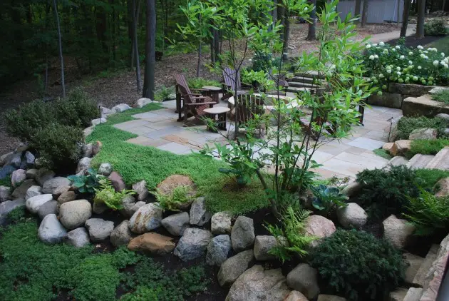
A good example would be in the use of accent boulders. If you’ve ever seen a landscape design that had one large white round boulder here and another large red square granite boulder there and so on, then you’ve seen that unity wasn’t created by this specific element.
This is just one example but the principle applies to all other elements such as groups of plants and materials.
A simple way to create unity in your landscape is by creating themes. And one of the simplest ways to create themes is by using a little garden decor or garden statues. Creating a theme garden is easier when it’s related to something you’re interested in or have a passion for.
If you’re into butterflies for instance, you could create a theme using plants that attract butterflies as well as using statues, ornaments, and other decor that are related to butterflies.
Unity should be expressed through at least one element in your landscape and preferably more. Using elements to express a main idea through consistent style and a specific theme is what creates harmony.
Simplicity is actually one of the principles in design and art. It’s one of the best guidelines you can follow as a beginner or do it yourselfer. Just keep things simple to begin with. You can do more later.
Simplicity in planting, for instance, would be to pick two or three colors and repeat them throughout the garden or landscape. Keeping decor to a minimum and within a specific theme as well as keeping hardscapes such as boulders consistent is also practicing simplicity.
Balance in design is just as the word implies. Equality. There are basically two types of balance in landscape design. Symmetrical and Asymmetrical.
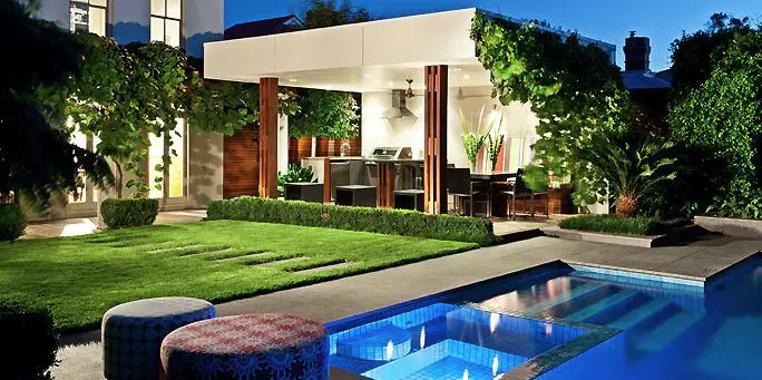
Symmetrical balance is where there are more or less equally spaced matching elements of the garden design. With a garden equally divided, both sides could share the same shape, form, plant height, plant groupings, colors, bed shapes, theme, etc.
You may remember creating something like this when you were a kid in art class at school. Where you take a piece of paper, splash paint on it, fold it in half, unfold it, and then it magically creates an interesting symmetrical design. So symmetrical balance or design is somewhat of a mirror image or reflection.
Asymmetrical balance on the other hand is one of the principles of landscape design that’s a little more complex. While textures, forms, colors, etc. may remain constant to create some unity, shapes and hardscapes may be more random. This form of balance often has separate or different themes with each having an equal but different type of attraction.
A good example of this would be where bed shapes or paths differ on both sides of the dividing line. One side could be curvy with a sense of flow while the other side is straight, direct, and hard.
This can also create a neat contrast. Flowing lines are pleasing to the eye but the bold contrast of a curve with a straight line can be very interesting.
Asymmetrical balance isn’t necessarily limited to just the shape of your garden.
An example might be where one side of the garden is mostly large shade trees while the other side is predominately a lower growing flower garden or even a mix of both examples. This is only limited to your imagination.
Contrast and harmony can also be achieved using plants. Fine foliage verses coarser foliage, round leaves verses spiked leaves as well as color compliments and contrasts.
Plant height, color, and texture may be varied from one area to the next but each area should stay consistent within its own theme.
You’ll hear me talk about “themes” a lot. Many successful do it yourself designs follow a basic theme to achieve most of the principles of landscape design described on this page. The proper use of plants and garden decor or a mix of both is a simple way to achieve themes.
Color adds the dimension of real life and interest to the landscape. Bright colors like reds, yellows and oranges seem to advance toward you and can actually make an object seem closer to you. Cool colors like greens, blues, and pastels seem to move away from you and can make an object seem farther from you.
Grays, blacks, and whites are considered neutral colors and are best used in the background with bright colors in the foreground. However, to increase depth in a landscape, you can use dark and coarse textured plants in the foreground and use fine textured and light colored plants in the background.
Colors can also be used to direct your attention to a specific area of the garden. A bright display among cooler colors would naturally catch the eye.
Natural transition can be applied to avoid radical or abrupt changes in your landscape design. Transition is basically gradual change. It can best be illustrated in terms of plant height or color but can also be applied to all elements in the landscape including but not limited to textures, foliage shape or size, and the size and shape of different elements.
In other words transition can be achieved by the gradual, ascending or descending, arrangement of different elements with varying textures, forms, colors, or sizes.
An example of a good transition would be a stair step effect from large trees to medium trees to shrubs to bedding plants. This example is where a little knowledge of proper plant selection would come in handy.
Transition is one of the principles of landscape design that can be used to “create illusions” in the landscape. For example a transition from taller to shorter plants can give a sense of depth and distance (like in a painting), making the garden seem larger than it really is. A transition from shorter to taller plants could be used to frame a focal point to make it stand out and seem closer than it really is.
Line is of the more structural principles of landscape design. It can mostly be related to the way beds, walkways, and entryways move and flow.
Straight lines are forceful and direct while curvy lines have a more natural, gentle, flowing effect.
Proportion simply refers to the size of elements in relation to each other. Of all the principles of landscape design, this one is quite obvious but still requires a little thought and planning. Most of the elements in landscape design can be intentionally planned to meet the proper proportions.
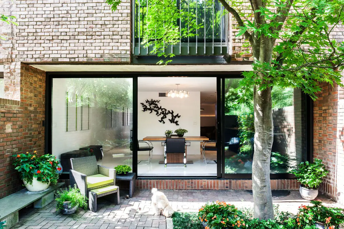
For instance if you are creating a small courtyard garden, an enormous seven foot garden statue placed in the center would be way out of proportion and a little tacky to say the least. Or a small four foot waterfall and pond placed in the center of a large open yard would get lost in the expanse.
Don’t misunderstand this to mean that if you have a large yard you can’t have smaller features or garden decor. Proportion is relative and elements can be scaled to fit by creating different rooms in the garden. The goal is to create a pleasing relationship among the three dimensions of length, breadth, and depth or height.
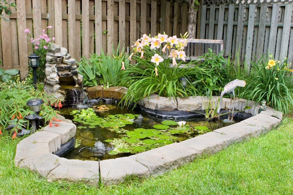
A small water feature can be proportionate if placed in a corner or on the edge of a large area and becomes a focal point of the larger area while creating its own distinct atmosphere. An entire room, sitting area, or theme can be created around it. Other rooms and themes can be created as well. See small gardens for ideas on creating rooms and creating illusions.
Also, special consideration and study should be given to proper plant selection to avoid using plants that are out of proportion.
Repetition is directly related to unity. Its good to have a variety of elements and forms in the garden but repeating these elements gives variety expression.
Unity is achieved by repeating objects or elements that are alike. Too many unrelated objects can make the garden look cluttered and unplanned.
There’s a fine line here. It’s possible that too much of one element can make a garden or landscape feel uninteresting, boring and monotonous.
However, unity can still be created by using several different elements repeatedly. This in turn keeps the garden interesting.

